
Build a game UI kit ready for nine-slicing
Generate buttons, panels, frames and bars with no text and true transparency, then slice them so they stretch to any size and any language.
- Playbook
Run it in ScenarioGPT Image 2.5 Sunburst
The parts a game interface needs (buttons, panels, frames, bars) in your game's style, empty and transparent, prepared for nine-slicing so a button fits "OK" or a long German word and the corners never stretch.
The brief
| Field | Brief |
|---|---|
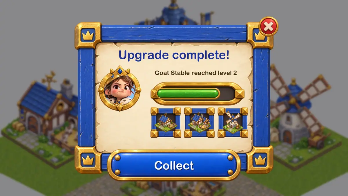
| Goal | A starter UI kit for Pipsqueen, a mobile strategy game by the invented studio Brightkeep Games |
| Parts | Primary button, dialog panel, close and settings buttons, progress bar frame and fill, toggle (on and off), inventory slot, round portrait frame |
| Format | Transparent PNG; button and panel generated large, then sliced |
| Fixed | Royal blue, cream and gold palette, chunky stylized 3D finish, light from the top left |
| Rule | No text, no numbers, no icons baked into any part |
| Accept when | The panel stretches to any size with intact corners; the button fits labels in three languages; every part has a clean alpha edge |
The kit matches the Pipsqueen village. The style anchors are the game's approved town hall and its hero, Queen Pip. The buildings in the slots come from Isometric tiles and buildings.
Approach
- 1Attach anchorsBuilding and hero as style references
- 2ButtonGPT Image 2.5 Sunburst, transparent, empty
- 3PanelConstant border, identical corners
- 4Small partsOne sheet, space between parts
- 5Cut and sliceAlpha shapes, measured borders
- 6Mock screenReal text at shipping size
Three rules carry the whole kit.
- Generate every part empty (Typeset text, never generate it). Text in a UI must change with the language, the value and the player, so it never belongs in the image. Ask for "NO text, no icons" in capitals and set all labels in the engine. See Text and typography in images.
- Generate for slicing. Ask for constant border width, identical corners, and a plain, evenly lit center. That is what makes nine-slicing work: the four corners stay fixed, the edges stretch in one direction, the center stretches in both.
- Slice in code or in the engine (Do the exact part in code). The model draws; code measures the border and cuts. See Let code own what must be exact.
As of October 2026, all parts came from GPT Image 2.5 Sunburst with Background set to transparent and two style anchors attached; it is ranked first for transparent game assets. Large single parts (the button, the panel) got their own generation for the most detail; small parts came together on one sheet.
Steps
-
Attach the style anchors (Lock a style anchor). Open Create, choose Images, pick GPT Image 2.5 Sunburst. Under Reference Images, add your anchors (here, the town hall and Queen Pip). Under Settings, set Quality to
highand Background totransparent. -
Generate the primary button. This run used a wide custom size, 1536x512, set through the Scenario MCP. The web panel's Dimensions menu offers presets only; the widest is 21:9 (3360x1440), so in the panel use it and crop the button afterward. Prompt:
TextReferences 1 and 2 are the style anchors of this game (a building and the hero): match their chunky stylized 3D look, soft global illumination, tactile materials, royal blue, cream and gold palette and top-left light. Do not copy their objects. Game UI element: one wide primary button, empty, with NO text and no icon. A chunky rounded rectangle, glossy royal-blue enamel face with a soft top highlight, a thick gold rim with four small gold rivets, a darker blue bottom edge for depth, like a tactile toy button. Flat front view, perfectly horizontal and symmetric, centered, filling about 90 percent of the width. The middle of the button is plain so it can be stretched horizontally. Transparent background, no shadow outside the button.Click Generate. The price shows on the button before you run.
-
Generate the dialog panel. Same anchors, Dimensions 1:1 (1024x1024), and a prompt that describes slicing in plain words: "one empty dialog panel, front view, perfectly square and symmetric. A cream parchment center that is plain and evenly lit so it can be stretched, a chunky painted royal-blue wooden border of constant width, gold corner pieces with a small crown stud in all four corners, all four corners identical. NO text, no icons, no title bar."
-
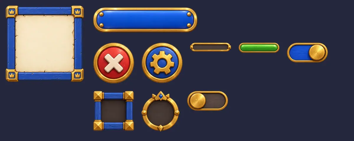
Generate the small parts on one sheet. Dimensions 3:2 (1536x1024). List each part and ask for space between them:
TextGame UI kit sheet, front view, every element separate with generous empty space between them, laid out on a clean grid: a round red close button with a white X, a round blue settings button with a gold gear, an empty horizontal progress bar frame in gold with a dark empty track, a short green fill segment for that bar shown on its own, an on/off toggle in both states, a square item slot frame in blue wood and gold, a circular character portrait frame in gold with an empty dark center. NO text, no letters, no numbers anywhere. Transparent background, no shadows outside the elements.Put the same anchor paragraph first. The close X and the gear are symbols, so they stay in the art; everything readable stays out.
-
Cut the sheet into parts. Download as PNG. A short script finds each separate shape in the alpha channel and saves it as its own file, trimmed to its edges. The sheet in this run split cleanly into eight parts: close, settings, bar frame, bar fill, two toggles, slot and portrait frame.
-
Measure the slice borders. Trim each large part, then measure where the corner ornament ends. For the 936x917 panel, the gold corner pieces end about 155 pixels in, so a 170-pixel border keeps them whole. For the 1485x360 button, the rivets end about 145 pixels in, and 210-pixel caps on the left and right keep the rivets and the rounded ends. Enter these values as the sprite's border in your engine, or cut in code.
-
Assemble a real screen. Build one screen from the parts with real text, at the size it ships, before you call the kit done.
With the Scenario MCP: run model_openai-gpt-image-2-5-sunburst with referenceImages: [anchor_1, anchor_2], background: "transparent", quality: "high" and the width and height of each part. Download with format: "png" for the widest compatibility with engines and editors; a JPG export flattens the alpha channel.
Check the result
no part contains letters or numbers; every edge is clean on a dark and a light background; the panel's four corners are identical; the button's middle is plain enough to stretch; all parts share one light direction and palette.
a part has baked-in text or an icon you did not ask for, corners differ from each other (they will not slice), the center carries a texture feature that smears when stretched, or a halo of background color rims the alpha.
The test that matters is stretching. Scaled plainly to a wide format, the panel's square gold corner pieces and crowns stretch into wide slabs, and the side borders thicken. Nine-sliced with the 170-pixel border, the same panel stretches to any width and the corners stay square.
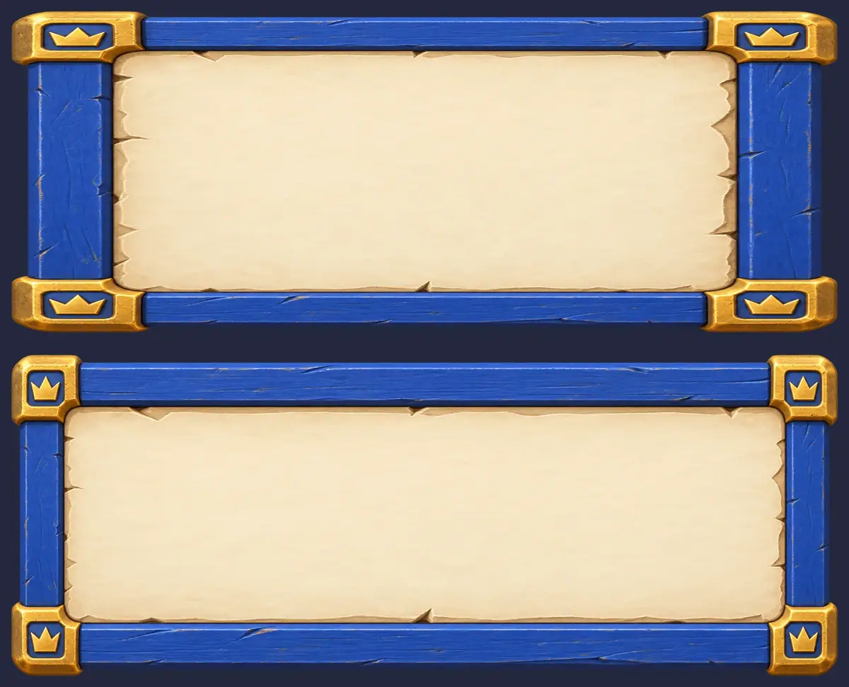
All three runs passed on the first try: no letters anywhere, clean alpha, four identical corners. The panel's center has a slightly torn parchment edge just inside the wood; it stretches without visible smearing at the sizes tested.
A perfectly flat center would be safer for very wide panels. Ask for "flat, untextured parchment center" if your layout needs panels much wider than tall.
1The dialog panel resized to a wide shape two ways. Which one goes in the game?
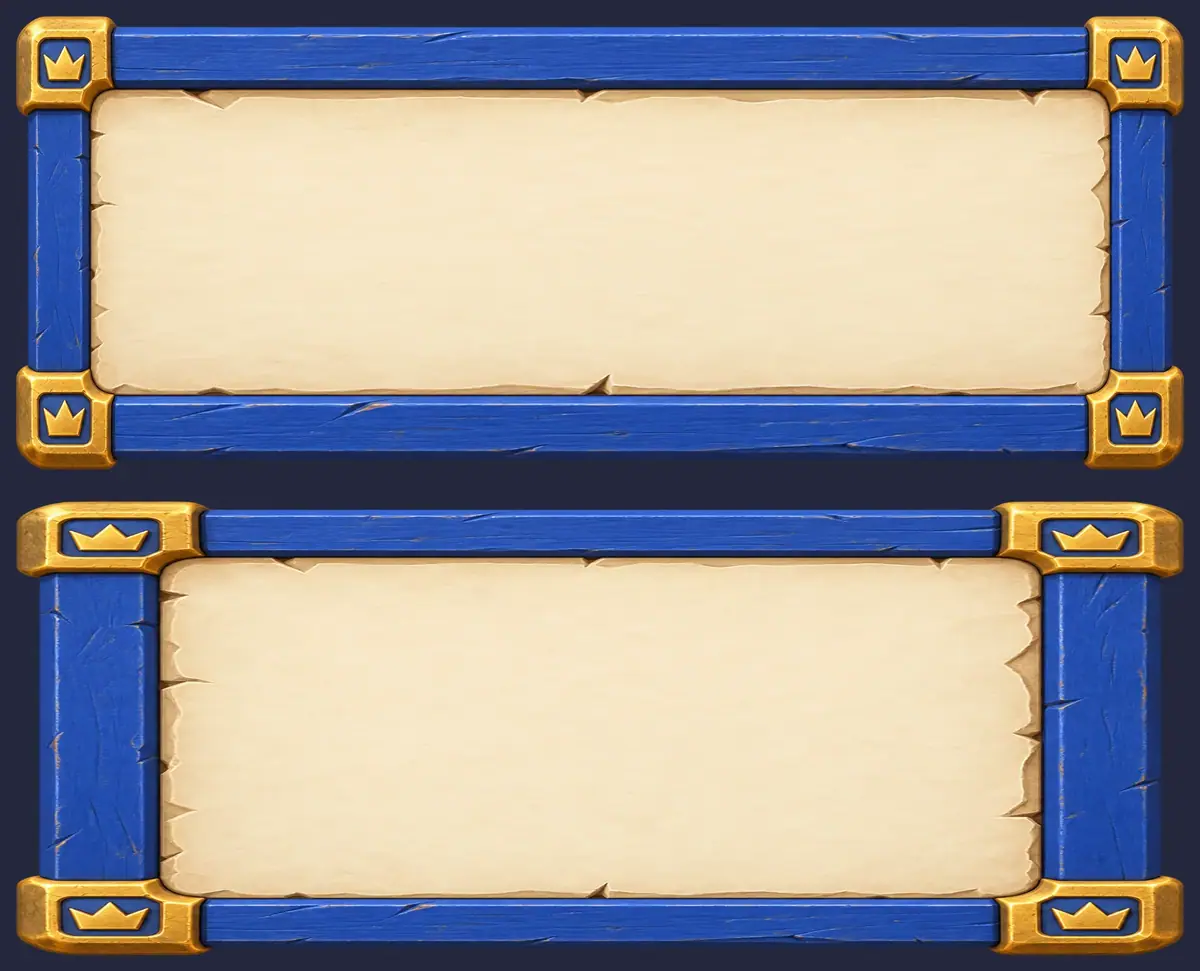
Answer: A. Take B was scaled plainly: the corner pieces and crowns stretch into wide slabs. Take A was nine-sliced with the measured border, so the corners stay fixed and only the edges and the center stretch.
2The small-parts sheet comes back with the word OK printed on the round button. What do you do?
Answer: A. Every readable label is set in the engine, because it changes with the language, the value and the player. A part with baked-in text fails the check.
Make it repeatable
- Store the kit with its numbers. Keep each part with its slice border in the file name or a small manifest (
panel_border170.png,button_caps210.png). Engines read the border once and reuse it. - Workflow for new parts (Package it as a workflow or skill). In the Node Editor: two Image nodes for the anchors, a Text input for the part description, a Prompt Builder that adds the fixed rules (no text, constant border, plain center), an Image Generator on GPT Image 2.5 Sunburst with transparent background, and an Approval node. See Build your first workflow.
- Platform App to compare. Under Workflows, Apps, Game UI Framer turns a character or object image into a game screen layout. It is useful for exploring screen ideas; for a production kit, generate parts empty as above.
Runs and time
| Step | Model | Runs | Kept | Wait |
|---|---|---|---|---|
| Primary button, 1536x512 | GPT Image 2.5 Sunburst, 2 references | 1 | 1 | about 40 s |
| Dialog panel, 1024x1024 | GPT Image 2.5 Sunburst, 2 references | 1 | 1 | about 50 s |
| Sheet of small parts, 1536x1024 | GPT Image 2.5 Sunburst, 2 references | 1 | 1 | about 45 s |
| Cutting, trimming, slicing, mock screen | local script | 0 | n/a | seconds |
About 1 minute with the runs in parallel. The three runs cost about the same; most of the time in this playbook is measuring and assembling, which costs nothing. The price shows on the Generate button before you run.
Variations
- Alternate states: generate pressed, hover and disabled buttons with the approved button attached: "the same button, pressed: face 4 px lower, darker blue, no highlight".
- Seasonal or event skins: reskin the whole kit with the method in Reskin a set of assets; keep the slice borders, which do not change if the silhouette does not.
- Mobile and console: generate parts at 2x the largest size you ship and downscale; slice borders scale with them.
- Non-game apps and learning platforms: the same approach makes branded panels and badges; replace the anchors with your brand assets.
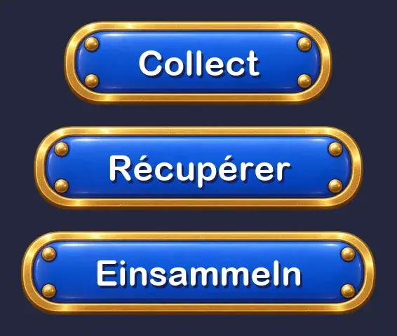
- Localization test: before shipping, run the longest translated label through the three-sliced button, as in the comparison above.
If it breaks
- Text appears on a part. Put "NO text, no letters, no numbers" in capitals and repeat it at the end. If one sheet keeps producing labels, generate that part alone.
- Corners are not identical. Ask for "perfectly symmetric, all four corners identical"; if one corner still differs, mirror the best corner in code.
- The center smears when stretched. Ask for a plain, evenly lit center, or fill the center region in code with a flat color sampled from the part.
- Parts touch on the sheet and cut as one. Ask for "generous empty space between them" or generate fewer parts per sheet.
- A colored halo shows around the alpha. Download as PNG, which engines and editors read most widely, not JPG; if the halo persists, run Remove Background on that part.